|
There
are three types of sheets
in the posters:
-
The
title sheet
[t] requires
two joined pieces
of printed paper
and it includes
the project
title,
the
names of the projectees
and the
names of the supervisors.
The title sheet
has three parts:
-
The title in
24pt
(or slightly
larger) upper-case
and lower-case
letters.
-
The students'
names, on at
most two lines
below the title,
are in 18pt
upper-case and
lower-case letters.
-
The supervisors'
names on one
line below the
students' names,
are in 18pt
upper-case and
lower-case letters.
-
The logos(s)
[l] which
represent the EMB
and the CS
Department
are placed in the
upper-left and upper-right
corners of the board
respectively. The
logos have a standard
format and size
(they
are provided).
-
The
information
sheets [a1, a2,
a3] contain
the content
of the poster. You
should design your
information layout
according to the
following guidelines:
- The
introductory
paragraphs should
be in a larger
typeface than
you use in a
detailed descriptive
section. The
typeface should
be readable
at a distance
of two to three
meters (while
the smallest
type you use
may be readable
at distance
of only one
meter). Generally
speaking, keep
in mind that
the larger and
bolder your
presentation,
the more enticing
it will be to
the people seeing
it at a distance.
The real challenge
then, after
you have attracted
attention to
your poster,
is to provide
enough interesting
and readable
detail for someone
who wants to
learn more.
One compromise
might be to
have some parts
that are packed
with useful
information
and are typeset
in a smaller
font. Don't
forget, however,
that important
results should
be big enough
for reading
at a reasonable
distance!
-
You should try
to use paragraphs
with centered
titles, such
as "Overview",
and "Results"
in 18pt
upper-case and
lower-case boldface
letters.
-
Make effective
use of titles
for paragraphs,
figures and
other material.
Use a typeface
that is readable
at two to three
meters (boldface
helps) for the
major part of
the titles (for
visibility)
and regular
type for details.
-
A multicolumn
format
usually improves
readability
by reducing
line length
and allowing
for more text
structuring.
-
Figures
(including diagrams,
charts, graphs
and schematics)
are a good way
to communicate
interesting
ideas.
Poster
Construction:
-
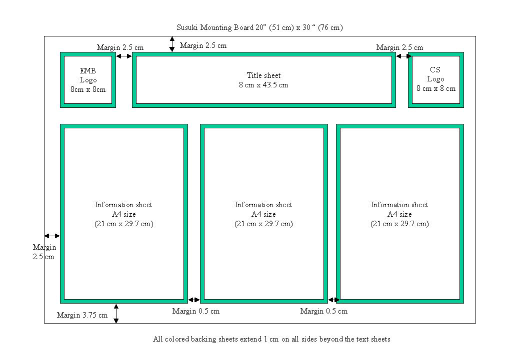
Use
a poster board
(20"x30")
obtained from
us.
-
A
poster consists
of three
A4 sheets of white
paper
laid out as shown
on the poster
schematic.
-
Text,
figures, charts,
graphs and tables
should be computer
generated
on white paper.
Their number,
size and placement
are your choice.
-
All
sheets are to
be mounted
on colored paper
(obtained from
your tutor(s))
that extends
1cm
or so beyond the
edges of the sheets
to act as a "shadow
frame". The
width of the frame
is your choice.
|
