More about HKUST
Fostering Engagement in Technology-Mediated Stress Management with Biofeedback Design
The prevalence of functional and affordable wearable biosensors has led to an increase in stress management applications for learning about and improving one's mental health. Previous research suggests that different types of graphical interfaces may evoke diverse user experiences with biofeedback interpretations and related interventions. However, a thorough account of how to engage users with a proper visual representation of the guided stress management training is still currently lacking. Therefore, the HKUST HCI Initiative conduct research on understanding how different biofeedback designs would affect user engagement during a guided stress management practice led by Dr. Xiaojuan Ma.
In particular, we systematically investigate the effect of various biofeedback visual designs on supporting user engagement during a guided stress management practice. Specifically, we hypothesize that certain visual designs will affect user engagement and, thus, the training attention and physiological measures, due to their specific design features. Following a series of design studies, we assess five different styles of visual design and, for each style, we identify a suitable representative (i.e., raw numbers for the numerical style, bar charts for the analytical style, waves for the illustrative style, butterfly drawings for the artistic style, and table lamps for the ambient style).
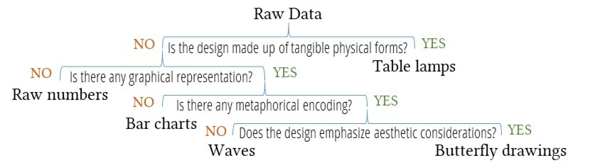
The design decisions made during the design process. The leaf nodes represent the final design choices made after each criterion.
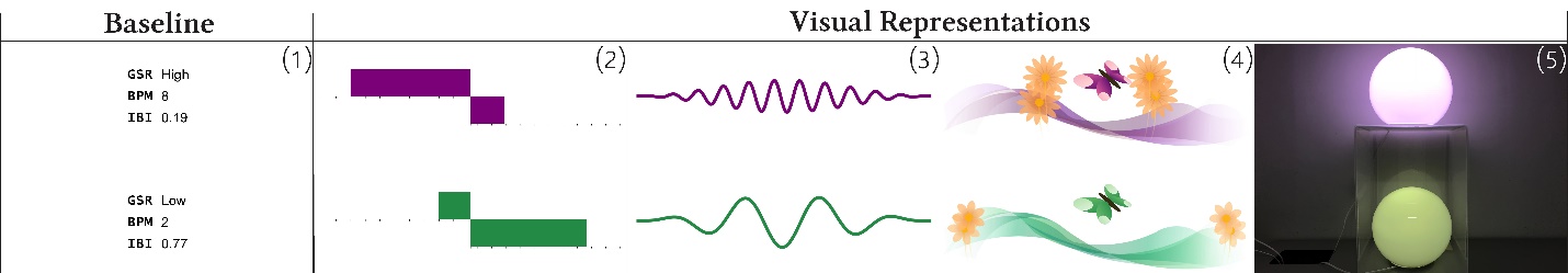
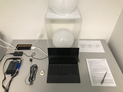
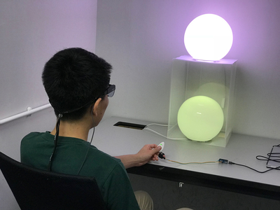
These designs are (1) raw numbers, (2) bar charts, (3) waves, (4) butterfly drawings, and (5) table lamps, respectively. For each design, the upper part provides guidance view, while the lower part presents the user's real-time biofeedback display. These examples demonstrate the same record of one participant at a particular moment, where the upper part shows a stressed state while the lower part shows a calm state. You may refer to the project page to explore more with the animated gif.
In a controlled within-subject experiment with 35 participants, we assess these five designs through a biofeedback-assisted stress management practice. We find that, overall, visual representation of data increases engagement and, thus, better facilitates stress management training when compared to a numerical display. The analysis through the results suggests that a certain level of abstraction in the interpretation of data encoding helps users move away from being judgmental; whereas animations and transitions augment the experience of being in the present moment.
From the statistical results and participants' responses, we learn that each design has its own strengths and weaknesses. Without visual encodings, raw numbers provide concrete, precise details of the raw signals, but is deemed tedious. Bar charts use traditional statistical graphics. It is intuitive for users to identify a stressful moment through comparison, but its well-known usage in analytical tasks may put users in a judgmental mindset. Waves exploit direct visual analogs and present in geometric shapes. An abstract design can significantly improve the fluency of visual data processing, but striking a balance between intuitiveness and interestingness is non-trivial. Butterfly drawings leverage aesthetic metaphors to create experience-oriented visual design with the intent of making art. It is sometimes difficult to balance artistic value and communicativeness, as embellishments that are pleasing to the eyes may distract the mind. Table lamps design provides a source of relatedness and enables an immersive experience with the data. However, certain encodings (e.g., transparency, the spatial region in our case) that are commonly used in visual displays are not readily applicable to every physical display. The last three designs (i.e., waves, butterfly drawings, and table lamps) have several pitfalls. They all fail to provide precise quantitative measurements, and their visual encodings entail a learning cost.
Navigation

Navigation

 Facebook
 LinkedIn
 Instagram
 YouTube
 Contact Us